

I’ve just had the chance to use Component Builder on a real project for the first time—not tinkering at home in the evenings, but a real implementation I had to think through from architecture to execution. And buddy, I’ve got a few comments about it.
Component builder
Component Builder is truly a game changer when it comes to implementations in Configurable Workspaces. Instead of one big monolith, the entire implementation can be broken down into multiple smaller pieces, which are easier to test and maintain.
We are early. Are we?
Based on my experience with the early stages of UI Builder, I expected first versions of Component Builder to be unusable in real production work as well 🤷♂️. I was ready for stuttering, freezing during loading, and all sorts of instability.
But none of that happened.
It looks like ServiceNow has actually delivered a fairly polished product this time—one that’s ready right from the start 😉. And if you remember the first versions of UI Builder, that one was definitely not ready for real production from day one, to put it mildly…
My development
For one project, we needed to create a sort of SPA app inside a Configurable Workspace. A menu on the left, content on the right, a small submenu within that content with a few badges, and then a section displaying data—tables, charts, and a few error messages if someone messed up in the data.
Before, building such an app would have been painful. We’d probably have used different viewports, page collections, and other ways around.
With Component Builder, though, it’s actually fun. Every part of the app is now its own custom component: the left menu is a component, the right content area is a component, the submenu is a component, the badges (showing error counts for each submenu section) are a component, the data table is a component, and even the error list repeater is a component.
I felt like I was coding a React app—but inside UI Builder👌
#1 Categorization
And here’s the first thing that could use improvement: none of the components I created during development are meant to be public reusable components for other projects. I wasn’t building a “custom button” component that should be reused across workspaces. No. Everything belongs solely to our SPA app.
So, I’d appreciate better categorization of custom components. Some should be public and visible to others, but others are really just architectural sub-parts of a larger component and shouldn’t be publicly exposed.
#2 Cache
I already had a rough idea of how the SPA app would look, so I put myself into a kind of private agile-scrum mode and worked on multiple components in parallel—each in its own browser tab. That turned out to be efficient for development, but UIB clearly wasn’t ready for that.
When switching between tabs, the data in the right configuration panel often disappeared, so I almost always had to clear the cache and refresh the page to continue working. The component tree on the left also frequently broke—it wouldn’t display container contents, and sometimes the contextual menu (Add before, Add after, Delete…) wouldn’t appear when clicking a component.
Each time, I had to clear the cache and refresh the page. And there is more—try this yourself:
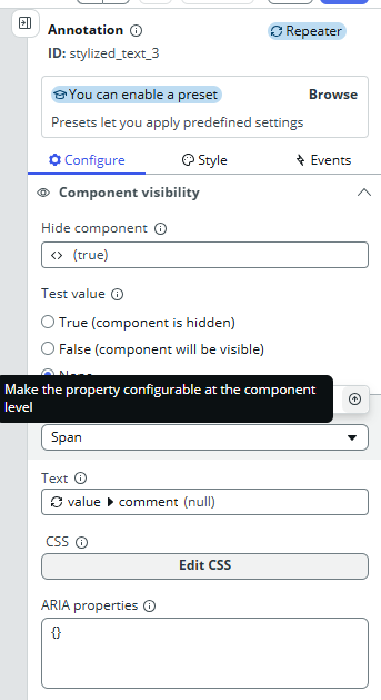
- Add two components under each other (for example, two Stylized text components, it doesn’t matter which).
- Implement a Hide condition on the first one.
- Click the second component and try to add a Hide condition there as well.
- What do you see? The Hide condition from the first component is now “pre-implemented” on the second one too, causing the change in one to reflect on the other and vice versa.
I was never able to apply separate Hide conditions on multiple components in one session. Every time, I had to clear the UIB cache, refresh the page, and only then could I continue.
That cache issue is terrible—it’s one of the things that really deserves improvement.
#4 Few more bugs I found
Now Code Editor
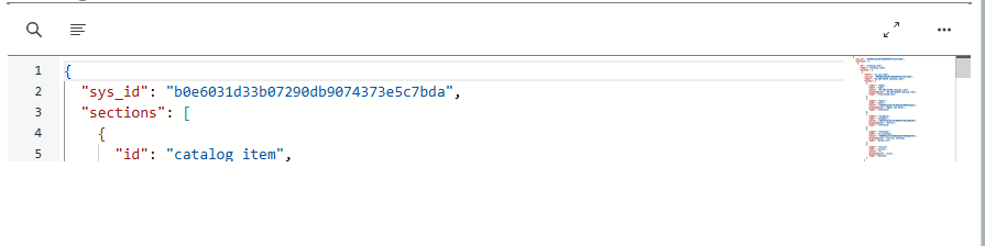
I needed to display a piece of JSON payload to the user, so I tried using the out-of-the-box Now Code Editor. It turns out the implementation makes it ridiculously small—it only shows about five lines and won’t expand any further. I tried all sorts of styling tricks and flex tweaks, but nothing helped. The code editor stayed that small. Of course, there is an Expand button, but that will expand to fullscreen, which is not the desired behavior for our use case.
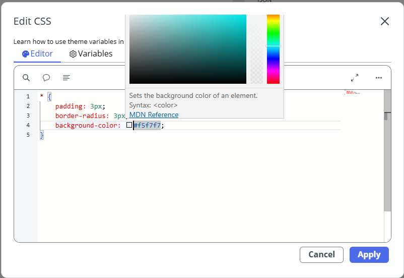
Color picker in CSS editor
Sometimes I needed custom colors, so I went to Styles > CSS for the component and tried setting background-color: something;. When you type in a color, a color picker appears—but it’s partially covered by the CSS window itself, making it practically unusable.
Fixes
On the other hand, there are some fixes finally as well. I noticed that when you implement a boolean state and want to assign the value to it after some action (button click > set boolean state), there is the true/false checkbox finally. No more “true” / “false” strings in the state value. This bug was there for really long time and it’s been finally fixed 🙏.
A few closing notes
Dynamic styling
It’s now possible to apply specific CSS styles dynamically based on internal conditions. That wasn’t possible before. Although I like it, there is still room for improvement. For example, if I want to share same classes in multiple components, that’s not possible now. I need to duplicate myself. Better CSS class organization would be fine.
👆 EDIT: I found bug there as well. When you have existing CSS style and would like to update it, it’s not possible to save your changes. If you uwant to change existing CSS style, you need to make it in backend 😦
Default values
When implementing a custom component that takes input properties, I can specify default values for testing and development. This way, I can immediately see how the component will look once it receives real data from its parent.
Creating a new component and navigation in general
When I’m working on one component and need to create a new one, I currently have to open the same page in a new tab and then click the icon in the top-left corner to get to the UI Builder landing page. In general, navigation back to the main page could use serious improvement. It’s ridiculous that I have to duplicate the tab (so I don’t lose my current work) just to reach the main UIB page. These exact shortcomings are what push people to create browser extensions 😜
Accessing existing components
On the other hand, I like that I can open the edit view of an existing component directly from the config panel.
What you see is what you get
I like that UIB has once again moved much closer to a true “what you see is what you get” experience. The page now renders nicely based on the data it has available. There’s still room for improvement though — for example, I noticed that when the Hide condition is scripted, UIB doesn’t take it into account. Still, thumbs up — the progress is visible.
Easier creation of States and Input properties
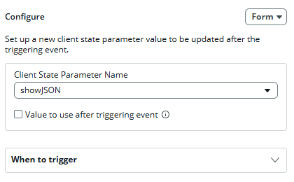
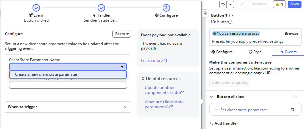
I also like that when you want to, for example, set a state on a button click and that state doesn’t exist yet, you can now create it directly from the state selection dropdown.
Similarly, if you want to bind a property of an existing component (like Stylized text) to an input property of your custom component, you can now create that input property right from the data binding menu.
Conclusion
Aside from the issues mentioned above, I’m pleasantly surprised by how well everything runs and how easy it is to implement even slightly more complex apps. The components have everything I’d expect them to—input properties, internal handled events, dispatched output events—and everything fits together nicely.
So far, it seemed that Component Builder was mainly intended as a tool for creating reusable components to be shared across different workspaces. But to me, it’s a powerful tool for building complex features and applications, where a component doesn’t have to be just a button or a textbox—it can easily be an entire page, which itself is composed of other nested pages / components.
Basically, it feels like standard development—just like in React. The only difference is that here, we’re inside ServiceNow’s UI Builder.
And I kind of like that 😎
Jan
 My UI Builder Corner ☕
Leave a comment