

We have quite a number of declarative actions on a workspace of our project. Some of them are very often used, some of them are global and agents use them only from time to time. Still, those actions take place in the Action bar. I was wondering whether we can something with that. And yes, we can 👇
Bridge to cross 🌉
Declarative actions / UI Actions (let’s call them Buttons for the sake of this post) can sometimes contain a lot of items. Some of them visible, some of them in the context menu.
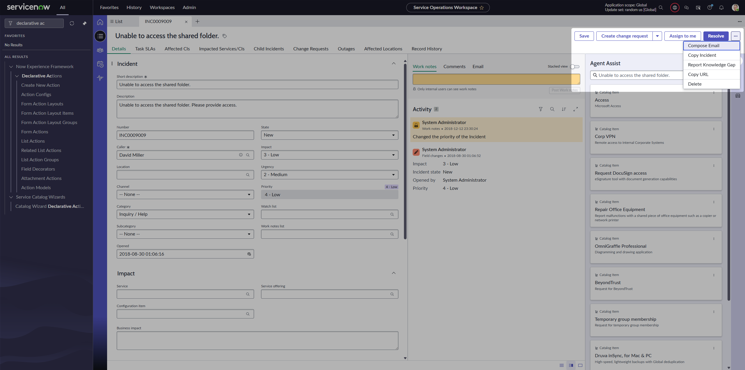
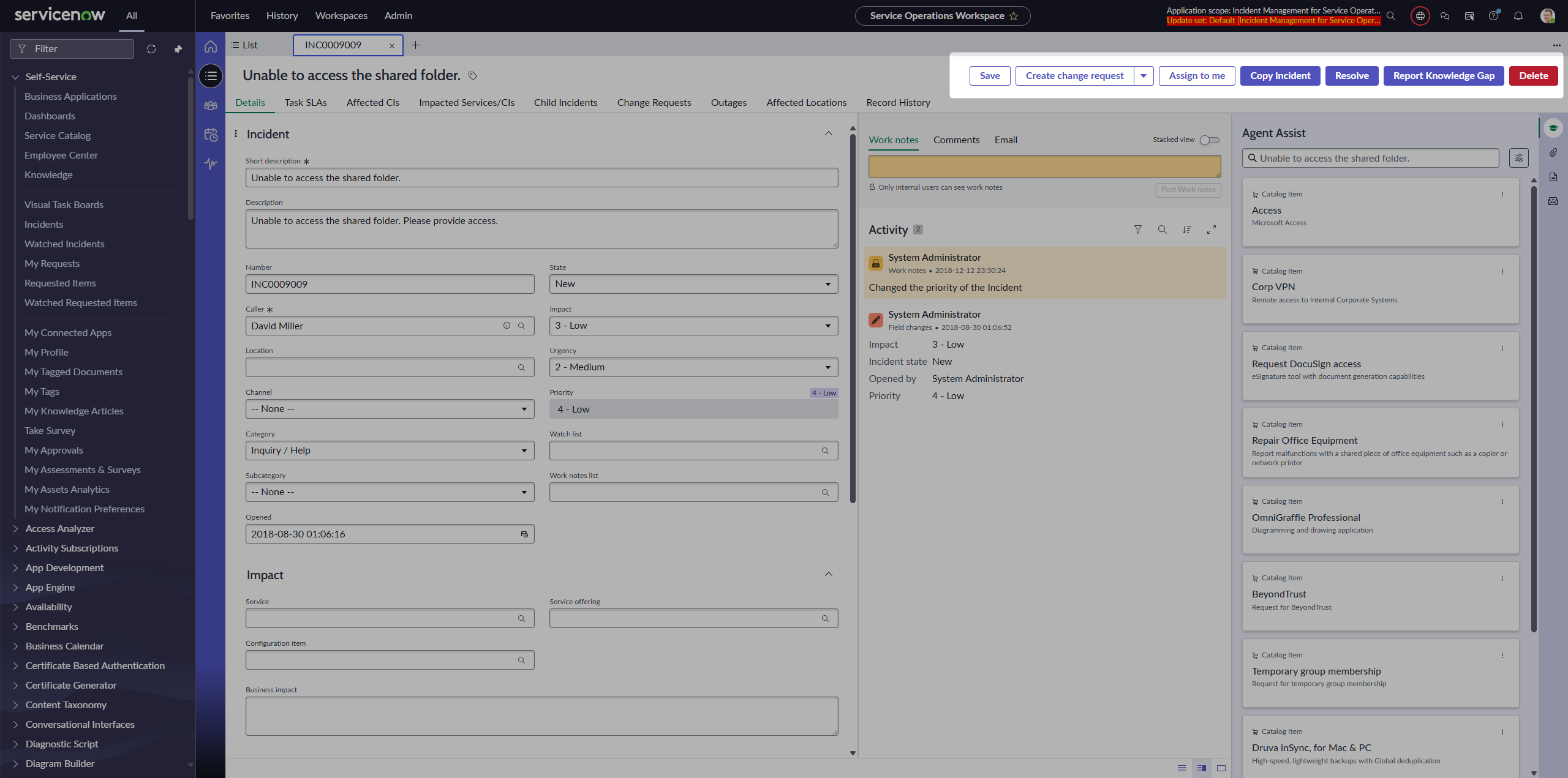
Of course, we can configure to move them. So let’s say we always want to see Compose e-mail and Copy URL. Easy to do, but they still take place there.
What if we wanted to give them icons only, without labels? It’s not possible; the backend does not allow us to save the Action Layout Item without a label (it’s a mandatory field).
Filtering them out 🚮
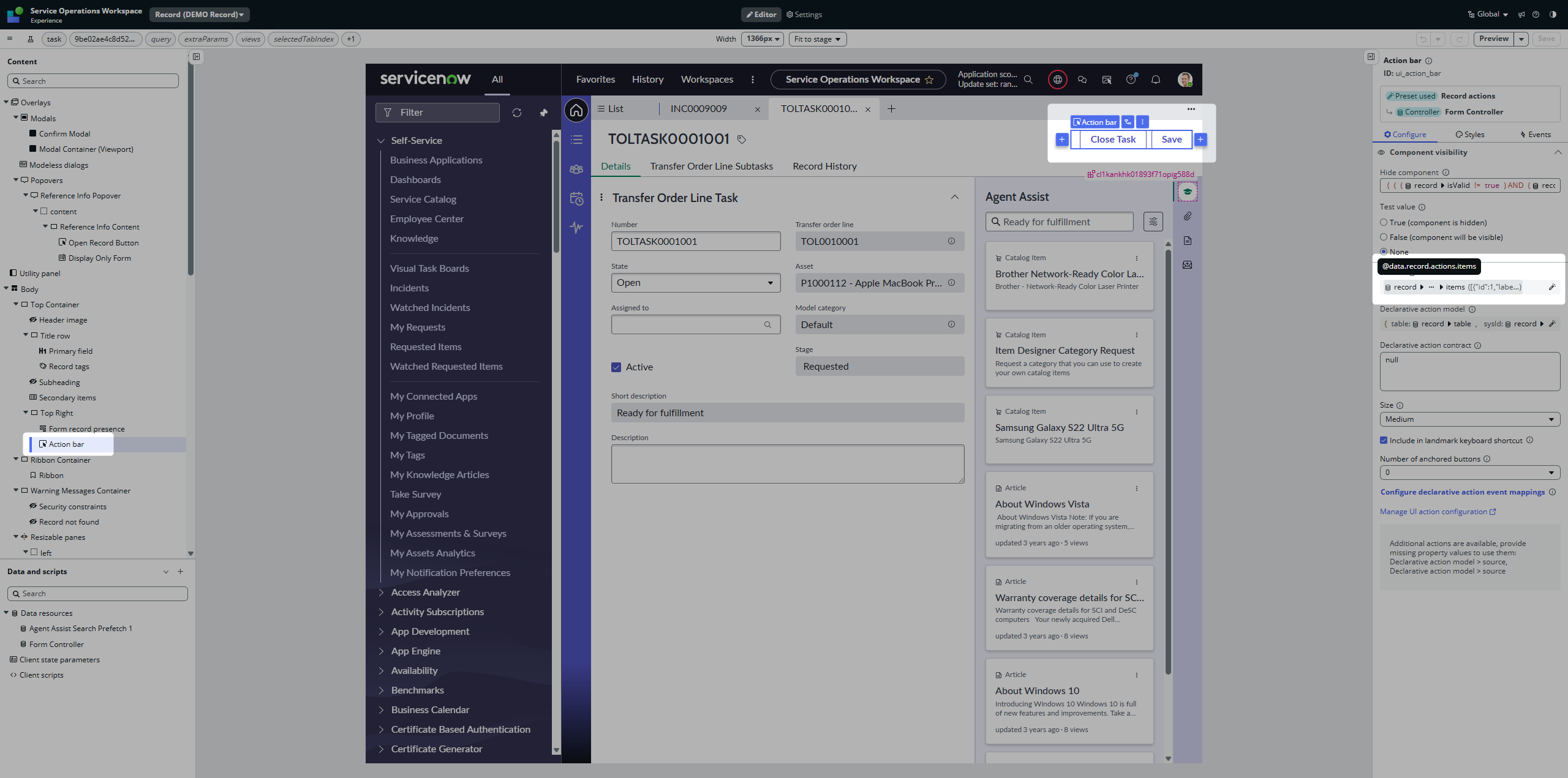
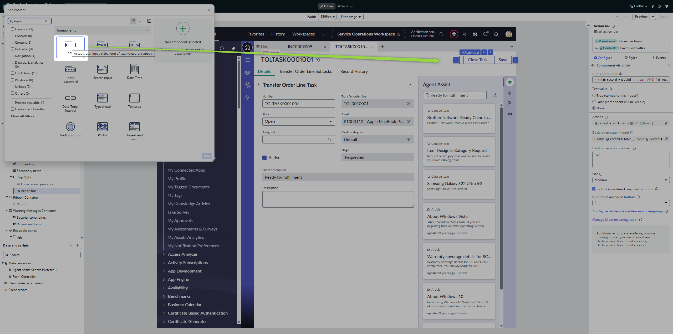
If you take a closer look at the Action bar component, you will see that there is an Actions property there. We know that components are dumb; they work only with what we provide them.
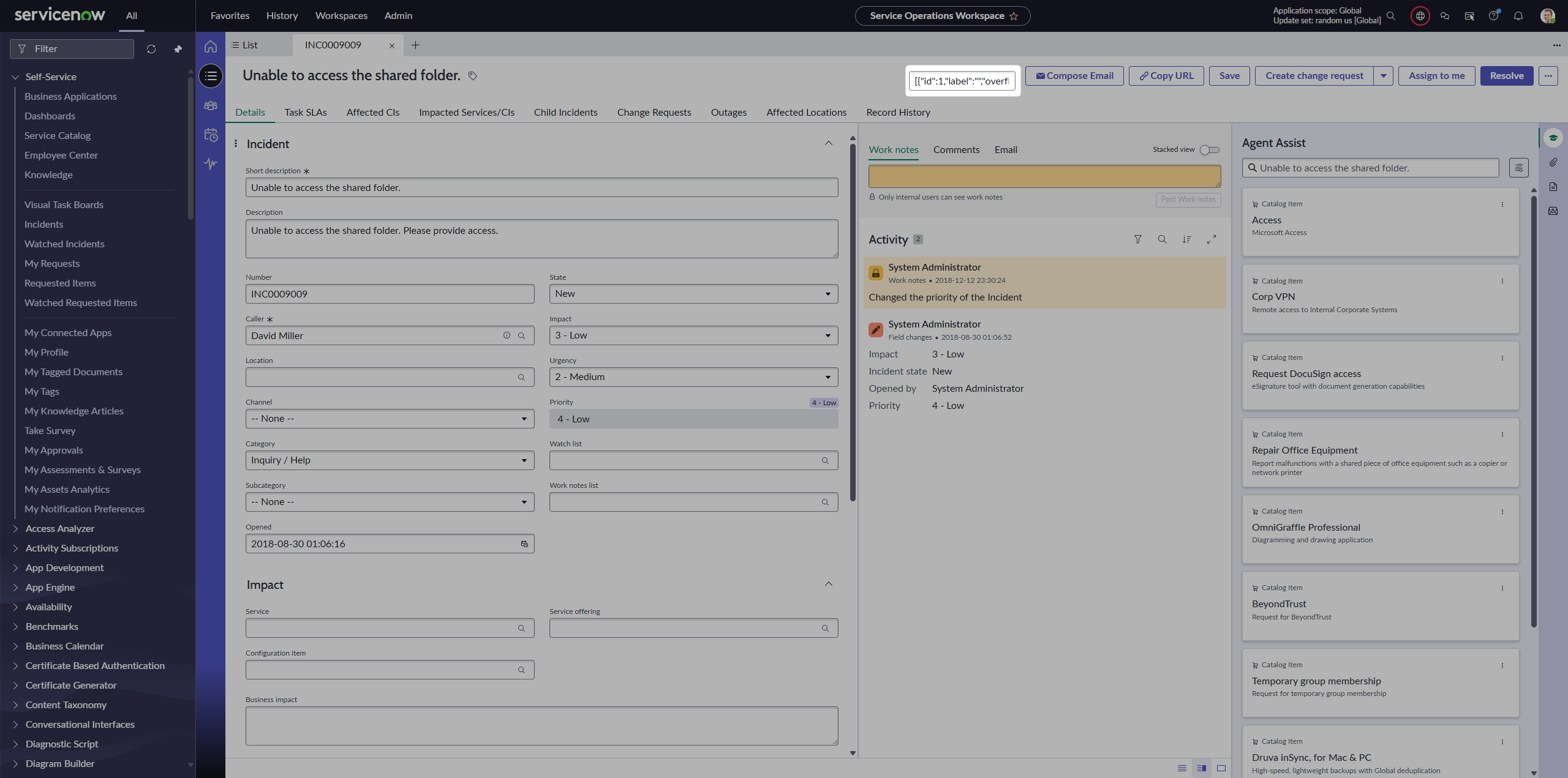
If you want to easily see how the Actions array looks, just place a simple Input component somewhere on the Page and stringify the JSON there.
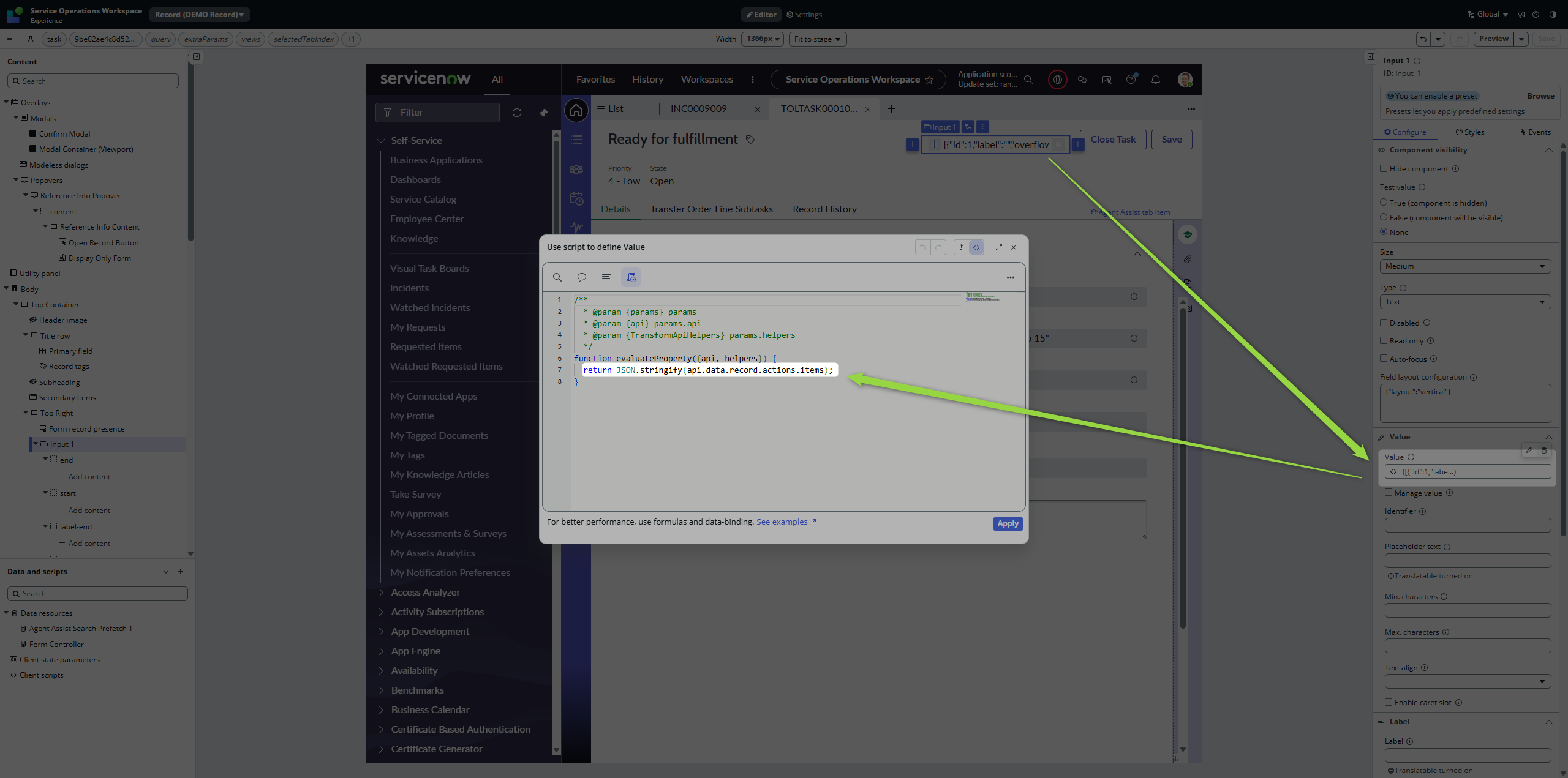
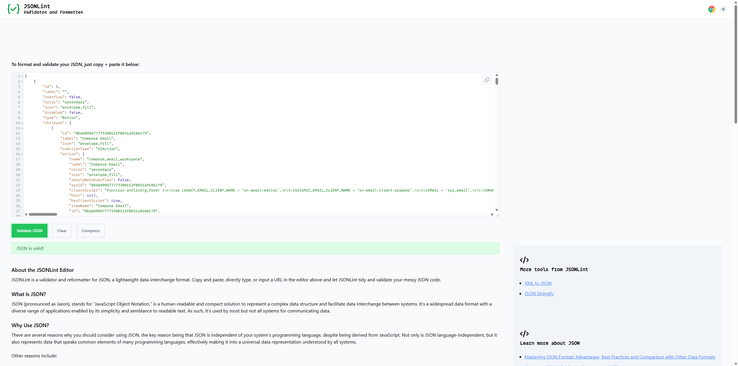
As soon as you know the structure, you can filter it 💡
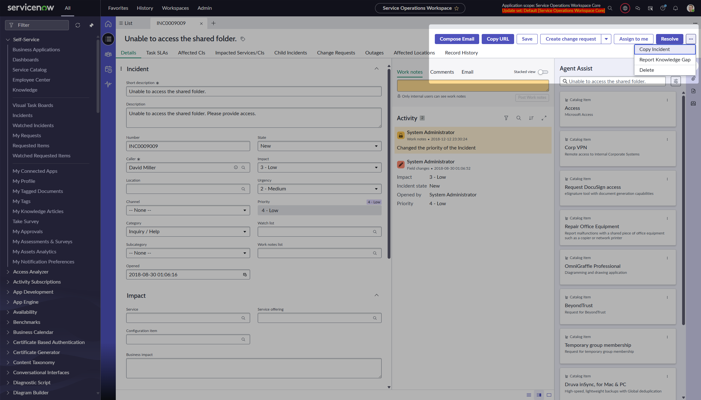
Go back to the Action bar, unlock the presets, and filter out Compose e-mail and Copy URL.
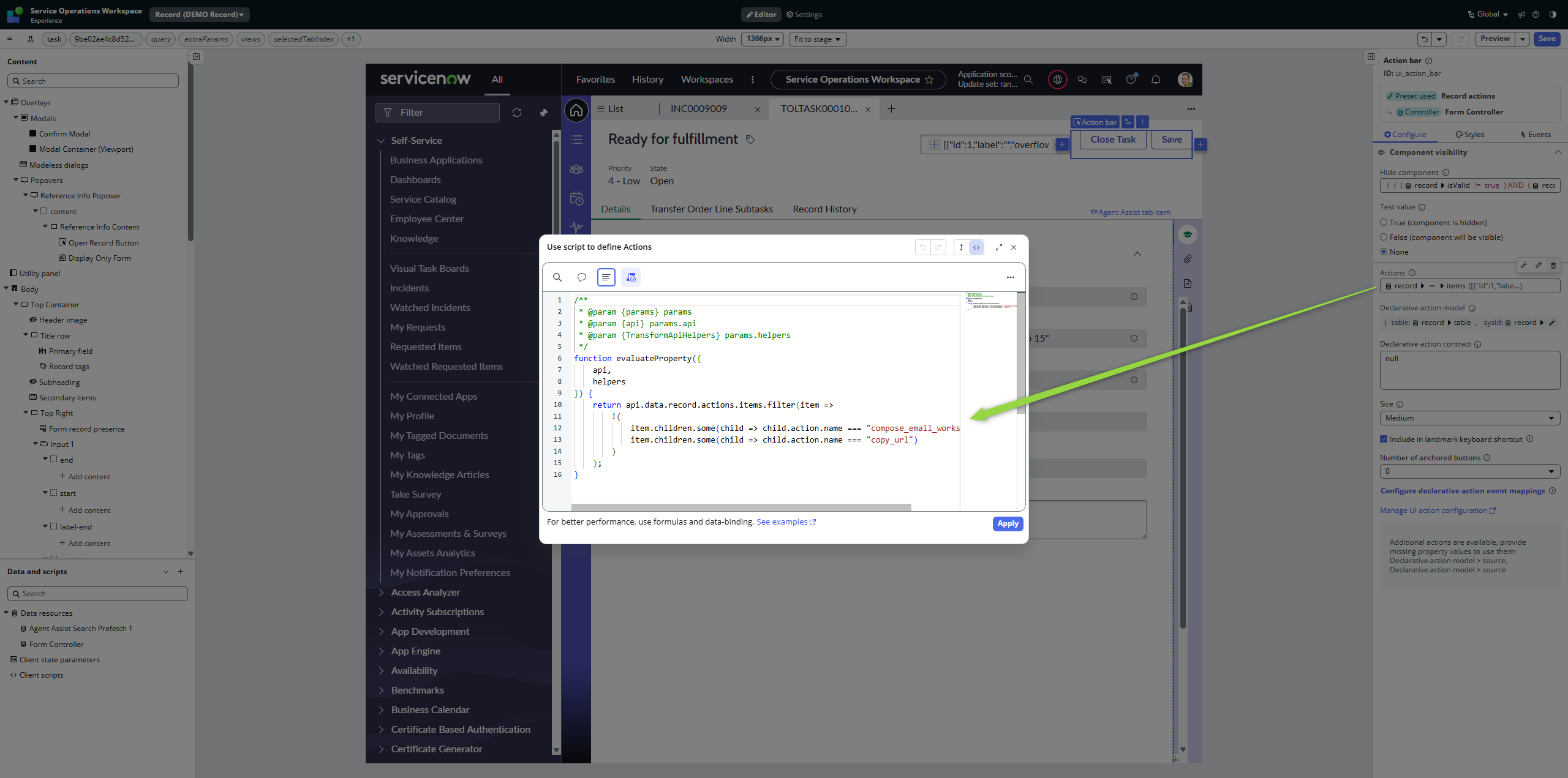
Mind the exclamation mark before the brackets. As soon as you save the page and go back to the workspace, those buttons will be gone.
Filtering them in 🧙
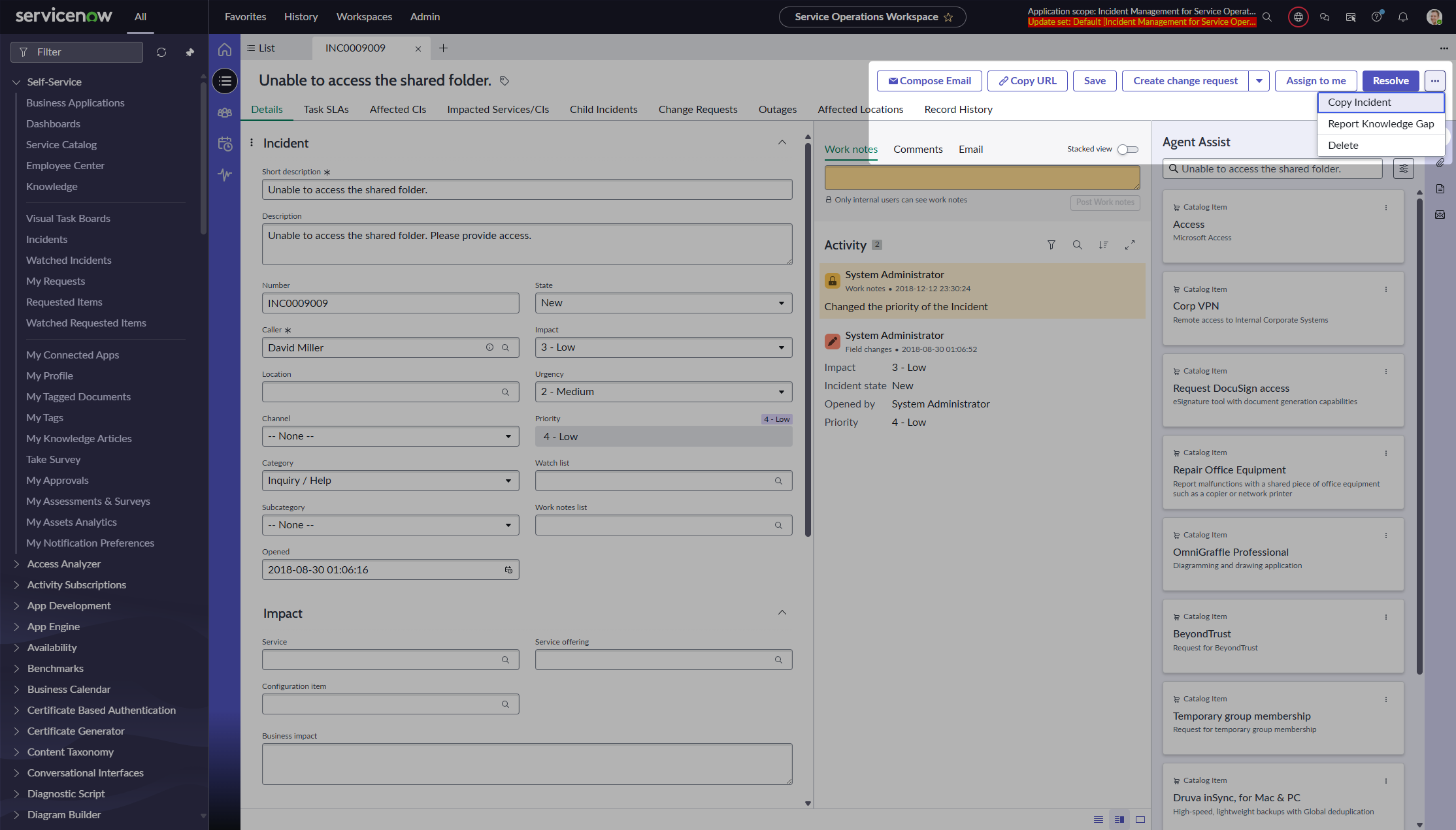
Here comes the trick. Go back to the UI Builder and insert another Action bar component before the original one. But in the property, remove the exclamation mark so we do the really opposite; filtering only those two buttons.
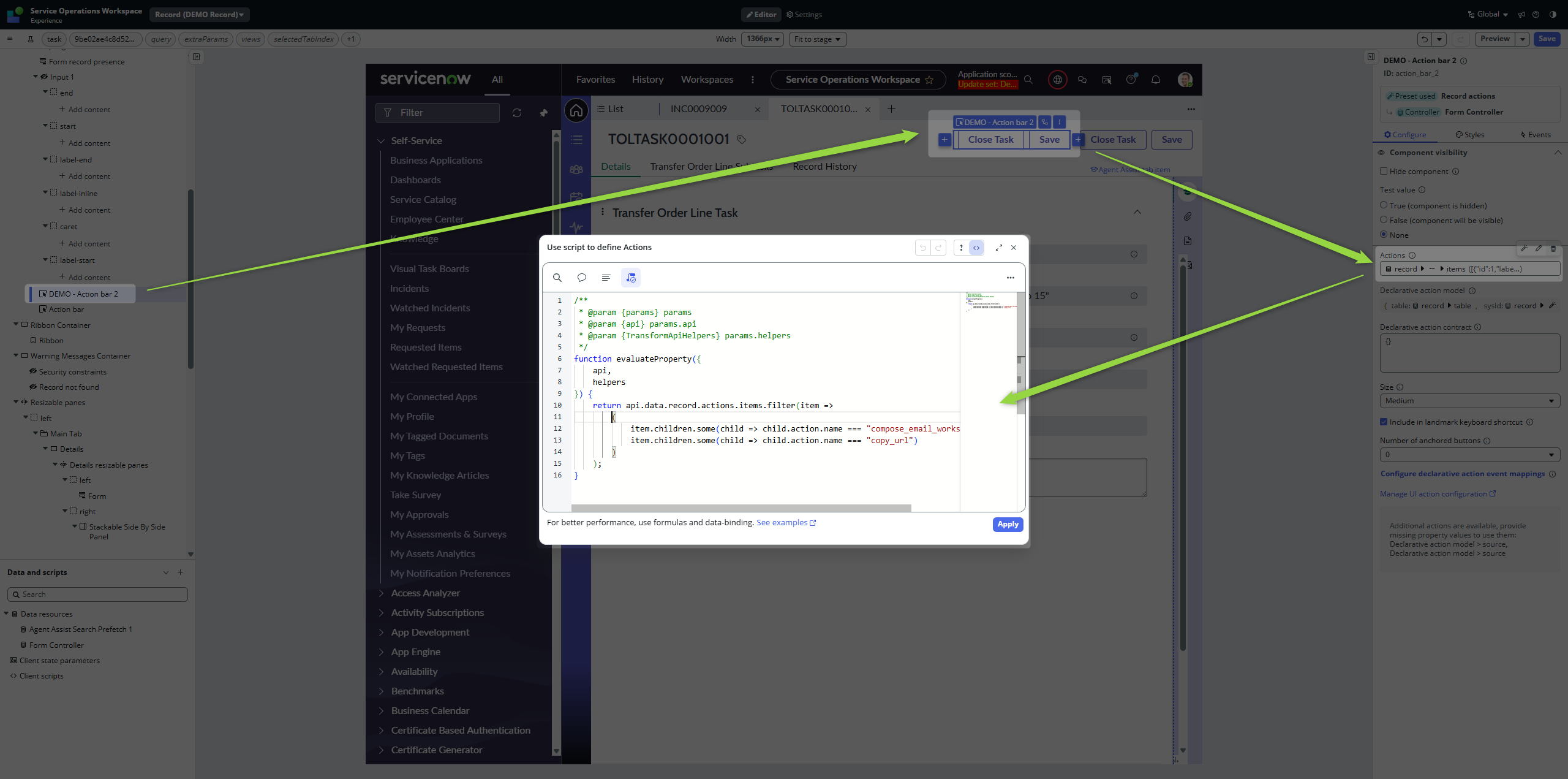
When you go back to the workspace, you will see our buttons in the Action bar row again. For users, they will look like one group of buttons, but now, those are two separate components.
And this is what we wanted. Split the buttons so we can adjust them and even move them around.
Adjusting
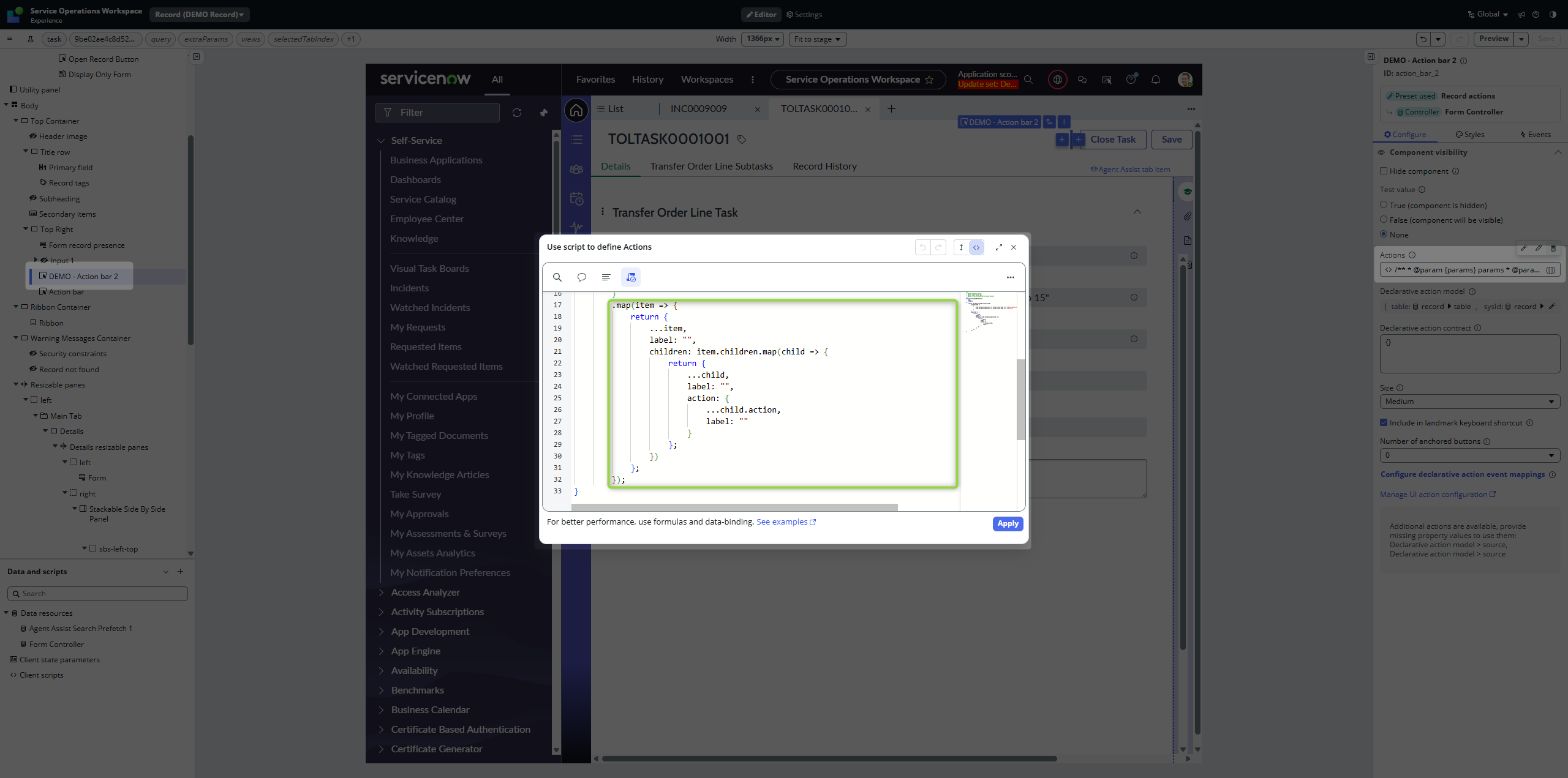
Add .map() in UI Builder on the Action property of our additional Action bar component to remove labels.
Moving around
Keeping in mind that we have separated the Action Bar component with our filtered buttons, we can move it anywhere on the page. The point is that they are still Declarative actions / UI actions, just placed in different places.
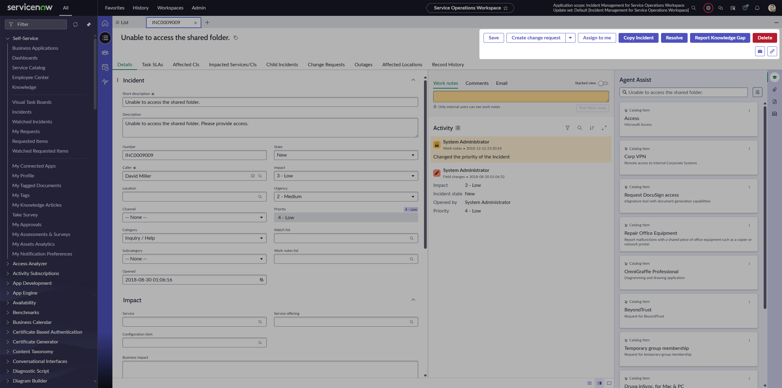
Putting them under original buttons:
Putting them next to the title:
The point is that now you can move this separated component anywhere you like 🙂
Conclusion
Declarative actions don’t have to clutter your Action bar. With a bit of filtering, splitting into multiple components, and some mapping tricks, you can turn the default mess into a clean, flexible layout that matches your workspace flow.
While this approach demonstrates what is possible in UI Builder, I admit that splitting Action bars and overriding labels is more of a creative workaround—so make sure you know exactly what you are doing. If you’re not sure, stick to recommended architecture patterns 😎.
Enjoy!
Jan
 My UI Builder Corner ☕
Leave a comment